
It’s been a long time since I’ve been involved in Pebble development, and I’m excited to be getting back into it.
Excited enough that I’ve already started making watchfaces again.
There’s something satisfying about building for a watch. You have a small screen, a handful of buttons, and a limited amount of processing power. Every bit of space matters.
I’ve been remembering how much I enjoy that challenge.
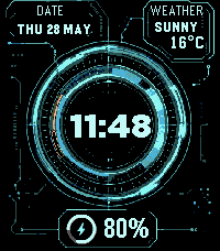
The first project I built was JARVIS. You want to make your wrist feel like Iron Man? Throw some cyan graphics on black, concentric rings, and a little dashboard of information around a big digital clock. Done. The goal was to make something that feels like a tiny futuristic interface on your wrist while still being readable when you just want to know the time. It shows the date, battery percentage with a circular indicator, and current weather conditions and temperature.
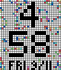
I’ve also been experimenting with watchfaces that make the screen itself a little more playful. LifeGrid puts a tiled clock into an edge-to-edge grid, with Conway’s Game of Life evolving around it. The screenshot gives you an idea of the look: big black digits surrounded by tiny cells and scattered bits of color.
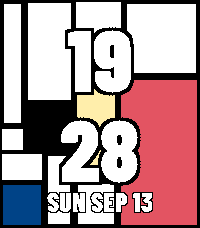
Passing Forms takes an abstract Mondrian inspired direction, creating a new geometric composition every minute. Large time digits sit over bold blocks of color and black-and-white shapes. It’s been fun exploring how much personality a watchface can have through its layout alone.
These watchfaces have been a fun way to get comfortable with Pebble development again, each with its own personality. You can find all of them on my Pebble Appstore developer page, and the screenshots above link to their individual listings.
They’ve already brought back a familiar habit: wondering what else I could squeeze onto this little screen.
It’s good to be back.
Comments
Loading comments…